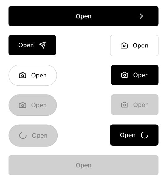
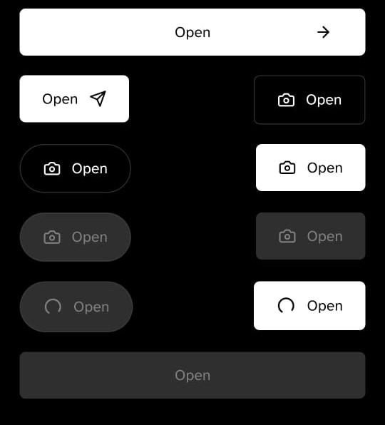
Button
Button components render a pre-styled button that can easily be re-style by using props.


Implementation code
import { Button, Icon } from 'rn-nativeflow';
import { ArrowRight } from 'lucide-react-native';

const Component = () => {
  return (
    <Button
      variant='outlined'
      title='Open'
      rightIcon='Send'
      renderRightIcon={<Icon renderIcon={<ArrowRight size={17} color='white' />} />}
      onPress={() => console.log('Button clicked!'))}
    />
  );
}
export default Component;
Props
| Prop | Type | Default | Description |
|---|---|---|---|
variant | outlined, contained | contained | |
type | round, flat | flat | |
fullWidth | boolean | false | |
paddingH | number | 30 with fullWidth prop and 20 without fullWidth prop | Horizontal padding of the button |
bg | string | #000 | Background color of the button |
br | number | 5 | Border radius of the button and it works when type='flat' |
stroke | number | 1 | Border width of the button and it works when variant='outlined' |
strokeColor | string | Border color of the button and it works when variant='outlined' | |
title | string | Button | Set title of the button |
titleColor | string | #000 | Set title color of the button |
titleFS | number | 12 | Set title size of the button |
titleFF | string | Set title font family of the button | |
titleFF | string | Set title font family of the button | |
size | number | 50 | Set the size of the button and it works when type='round' |
disabled | boolean | false | When true, this will disable the button |
renderIcon | JSX.Element | Set custom icon of the button and it works when type='round' | |
renderLeftIcon | JSX.Element | Set custom left icon of the button and it works when type='flat' | |
renderRightIcon | JSX.Element | Set custom right icon of the button and it works when type='flat' | |
onPress | function | Calls when someone click on button | |
buttonContainerStyle | object | Helps to change the styles of the button container | |
textStyle | object | Helps to change the styles of the button text |