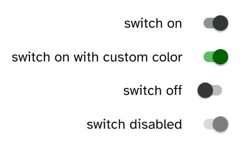
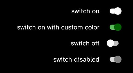
Switch
Switch components render a pre-styled switch that can easily be re-style by using props.
Implementation code
import { Switch } from 'rn-nativeflow';

const Component = () => {
  return (
    <Switch
        checked={true}
        size={0.8}
        color='#000000'
        onChange={(e) => console.log(e)}
    />
  );
}
export default Component;
Props
| Prop | Type | Default | Description |
|---|---|---|---|
checked | boolean | true | value of the switch, true means on and false means off |
color | string | It sets the color of the switch | |
disabled | boolean | false | Disable toggling the switch |
size | number | 0.8 | Sets the size of the switch |
activeTrackColor | string | It sets the track color of switch when checked = true | |
inactiveTrackColor | string | It sets the track color of switch when checked = false | |
onChange | function | it fired when the value is changed |